
The spreadsheet balances, yet the client still asks whether the figures are in rupees or lakhs. A negative variance appears in red, but nobody knows whether it represents overspending or lower revenue. The problem may sit in the presentation layer: the labels, numerical formatting and visual hierarchy through which the reader encounters the work.
For chartered accountants and finance teams, financial report typography means organising text and figures so that their meaning survives scanning, comparison and distribution. It supports the accounting analysis; it does not establish that the underlying numbers are correct. A useful starting point is one recurring management report, with a small set of rules that can be applied consistently each month.

Begin with the questions a client will ask
Imagine a fictional business receiving a monthly performance pack. Its owner wants to know what changed, why it changed and which items need attention. Before selecting a font, identify the reporting period, currency, scale, comparison basis and status of the figures. A title such as “Monthly performance” is incomplete if the page does not also identify the entity and month.
Put the unit beside the table or in the column heading, not only on a cover page that may be separated from the figures. If one schedule uses INR lakh and another uses INR crore, make that change visible. Use the same convention for repeated comparisons unless there is a clear reason to change it.
|
Display choice |
Risk for the reader |
Clearer treatment |
|
Amount shown as 12.5 |
Currency and scale are missing |
Label the column INR lakh |
|
Variance shown as 10% |
The calculation basis is unclear |
State actual versus budget and define the formula |
|
A dash in a numeric cell |
Zero, missing and not applicable are confused |
Define the symbol or use a specific label |
|
A red number with no sign |
Meaning disappears in monochrome |
Show the sign and explain the direction |
|
A rounded subtotal |
Displayed rows may appear not to add up |
Explain rounding where relevant |
Separate missing data from a genuine zero
A zero says something different from “not available.” Do not fill an incomplete schedule with zeros merely to make it look finished. Similarly, a blank cell may be overlooked when the report is printed. Agree on the meaning of each placeholder with the preparer and carry that convention into the report notes. This is a presentation control that depends on correct source classification.
Keep the scope explicit. A management pack allows many discretionary layout choices, while statutory statements and prescribed submissions may have specific presentation requirements. Apply the relevant reporting framework and instructions before adopting a house style. A visual redesign should not remove necessary disclosures or change their meaning.
Give numbers a consistent visual structure
Use tabular figures when the font and application support them and aligned numeric columns benefit from equal-width digits. Microsoft’s OpenType specification describes the feature as substituting figures on “uniform (tabular) widths.” This is a property of numeral spacing, not a promise that every character in the font is monospaced.
Right-align comparable amounts, use consistent decimal precision where appropriate, and keep the number format consistent within a column. Tabular figures help the digits line up, but they do not fix mixed decimal places, different units or misplaced parentheses. Confirm the result in the actual reporting software; selecting a font does not guarantee that an optional feature is enabled.
Show the calculation behind a variance
In the fictional example below, revenue rises from a budget of INR 12.0 lakh to actual revenue of INR 13.2 lakh. The difference is INR 1.2 lakh, or 10% of budget. Operating costs rise from INR 8.0 lakh to INR 9.1 lakh, a difference of INR 1.1 lakh, or 13.75%. Both differences are positive under actual minus budget, but their business implications differ.
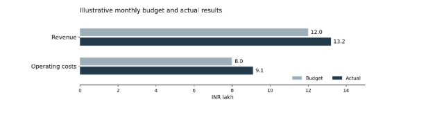
Invented demonstration data, not company results or industry benchmarks. Both series use the same scale and a zero baseline; values are in INR lakh.
Label the arithmetic direction separately from its interpretation. “Above budget” states a comparison; “favourable” requires context. Higher costs may accompany higher activity, and revenue alone does not explain profitability. The typography should make the comparison easy to read while leaving room for the accountant’s explanation.
The W3C summarises its Use of Color guidance as: “Color is not the only way of distinguishing information.” For a financial dashboard, pair colour with labels or signs. Apply the same practical principle to reports that may be printed in black and white. A chart legend should identify each series without requiring readers to infer what a shade means.
Avoid manufacturing precision
A display with four decimal places can imply a level of precision the underlying estimate does not support. Set display precision according to the purpose of the schedule and retain the underlying calculation data. Distinguish a formatting change from a change to the stored value, and check how rounding affects the totals visible to the reader.
Assign type styles to recurring reporting roles
A monthly pack rarely needs a new font for every section. Define styles for the report title, section headings, narrative, table labels and notes. Use emphasis to mark important conclusions and totals. If every row is bold, the hierarchy disappears; if notes are too small, the qualification may be missed.
Test the candidate family using realistic content: a long company name, a negative amount, Indian digit grouping, percentages and the rupee symbol. Include any Indian-language text the practice actually publishes. A family’s Latin alphabet coverage does not establish support for another script. Check the specific files and the output rather than relying on a specimen headline.
What real custom font projects can teach a finance team
Rocket, the American mortgage company, uses the custom typefaces WNTL and Bowtie in its identity. The foundry identifies WNTL as a customised TT Commons™ Pro and Bowtie as a customised TT Livret. This is a real example of combining different typographic voices within one identity. It does not show that either font improves the accuracy of a financial statement.
A second example comes from a different sector. TypeType lists a tailored version of TT Fors for Plugsurfing, a developer of an app for finding electric-vehicle charging points. The useful connection is the need to carry a visual identity into a digital service. The public description does not establish specific numeral features, accounting uses or performance gains, so those should not be inferred.
For an accounting practice, these examples suggest a procurement question: which recurring needs would adaptation solve? Often an existing family and disciplined templates will be sufficient. If custom work is considered, define the required symbols, scripts, weights and delivery formats before discussing appearance. Commissioning a typeface should follow a concrete brief.
Review the file the client will actually receive
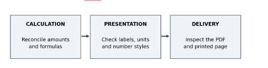
Three distinct checks for a recurring report. Passing the presentation check does not replace reconciliation of the underlying data.
Export the finished pack and inspect the PDF at a normal reading size. Check clipped headings, missing symbols, split rows and notes separated from their tables. Open the file on another device if possible. A substituted font can change line lengths and page breaks, even when the spreadsheet looked correct on the preparer’s screen.
Also check text search and copying. Sending a screenshot may preserve the visible layout while making amounts harder to search or reuse. Keep the approved source file and a versioned final report so the team can identify what was delivered. Use fictional or anonymised data when testing designs outside the authorised reporting environment.
Budget for the font rights the workflow needs
The design budget should include permitted use of the font software. List who installs it, who edits the templates and which channels receive the output. Office documents, a website, a client portal and video explainers can involve different rights. The invoice alone may not answer questions about embedding, contractor access or file transfer.
A practice evaluating options at typetype.org can use its reporting workflow as the basis for a licensing enquiry. Describe the staff devices, outside designer, PDF distribution and live website text so the supplier can identify the relevant terms. Keep the response with the agreement used for the purchase.
The foundry’s published guidance distinguishes Desktop and Webfont licences, among other categories. Desktop scope considers installed workstations, while website licensing has its own parameters. Its guidance also differentiates a finished design from handing over font files for further editing. Review the agreement for the specific purchase rather than applying one supplier’s categories to every font.
|
Workflow |
Assumption to avoid |
Question to resolve |
|
Team edits report templates |
One purchase covers every installation |
Which users or devices are licensed |
|
Designer supplies editable files |
Font files may always be passed on |
Who needs their own permission |
|
Report is exported as PDF |
Embedding is automatically authorised |
Which embedding and distribution rights apply |
|
Text appears on the practice website |
A desktop licence covers live web text |
What web scope and duration are needed |
|
Font is downloaded for testing |
Trial files may be used publicly |
What evaluation terms permit |
Retain the agreement, licensee details and renewal information. Review permissions when staff or channels change. Converting text to outlines is not a general workaround for permission and can reduce searchability.
A short handover checklist
- The period, entity, currency and scale are visible.
- Actual, budget and variance labels use a defined basis.
- Zeros, missing values and negative amounts are distinguishable.
- Tables remain readable in the exported and printed report.
- Font permissions match the editing and distribution workflow.
Frequently asked questions
Should every financial number use tabular figures?
Tabular figures are useful in tables because each digit occupies the same horizontal space, making columns easier to compare. They are less important in narrative text or headings. Check that both the font and reporting application support the feature, and combine it with consistent decimal places, clear units and appropriate alignment.
What should an accounting practice look for when choosing a report font?
Test readable numerals, distinct punctuation, regular and bold weights, and the currency symbols and languages your reports require. Use a realistic sample containing long company names, negative amounts, percentages and footnotes. Compare the screen version with an ordinary office printout before adopting the font across your templates.
How can a team check whether a font supports the rupee symbol?
Type ₹ into the actual application using the exact font file intended for production. Check it beside different amounts and in each required weight, then inspect the exported PDF. Some applications silently substitute a different font for unsupported characters, so a visible symbol alone does not confirm that the selected family contains it.
Why can a report look different after PDF export?
Font substitution, export settings and differences between applications can affect line breaks, spacing and pagination. Inspect the final PDF for clipped headings, missing characters, split tables and displaced notes. Where the licence permits embedding, verify that the export preserves the intended fonts. Also test whether amounts remain searchable and copy correctly.
Does a desktop font licence cover every use by an accounting practice?
Do not assume that it does. A licence may distinguish between workstation installations, PDF embedding, live website text, applications and other uses. External designers and colleagues who need the font files may also require permission under the agreement. Describe the complete workflow to the supplier and retain the applicable terms with the purchase records.











 CAclubindia