
Many times you would have seen red and green bars on stock market channels and wondered what they are. In this article, I will let you know what are these bars and their usage.
Fundamental analysis of stocks mainly focuses on the financial data of the company, its balance sheet, P/L and its long term strategies. On the other hand, technical analysis focuses on trends and patterns in the stock market. It is very evident that the past stock patterns repeat after some point of time. By reading and analysing those patterns, one can have an idea as to how a stock will perform in the near future. One of the ways to do technical analysis is by reading the candlestick charts.
What is a Candlestick?
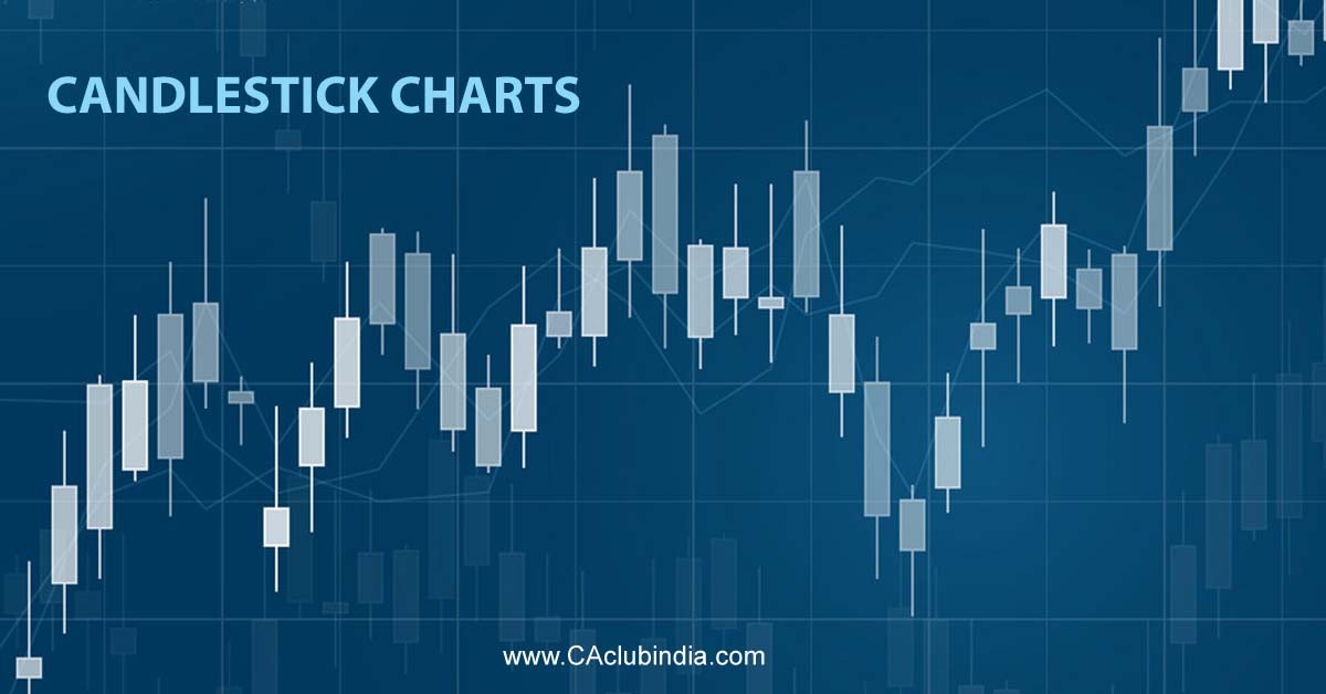
A Candlestick is a pictorial depiction of the price of a stock. It displays the high, low, open and closing prices of a stock/security. The origin of these candlesticks is from Japan in the 1700s where rice merchants used them to predict market prices. Generally a candlestick shows the price variations of a stock on a particular day. The candlesticks of different days when read collectively help to identify patterns and predict future prices.
Understanding a Candlestick
Candlestick offers a wide range of information in a simple manner. Each candlestick is composed of a body and wicks. The space between the opening and the closing price is know as real body.
A Green (or white) candlestick shows the closing price is above the opening price.
A Red (or black) candlestick shows the closing price is below the opening price.
The thin lines that extend from the top and bottom of a candlestick are know as wicks. The top of the upper wick represents the highest price touched by the stock. The bottom of the lower wick represents the lowest price touched by the stock.
Example: A stock opens at price Rs. 72 and closes at Rs.80. The lowest price of the day was Rs. 68 while the stock touched the highest price of Rs. 85.
Since the closing price is more than the opening price, it will be depicted by a green candlestick with lower wick end at Rs. 68 and upper wick end at Rs. 85.
Types of Candlestick Patterns
Bearish pattern are type of candlestick pattern in which the closing price for the period of a stock is lower than the the opening price. This creates immediate selling pressure for the investor due to decline in price assumption.
Bullish patterns are a type of candlestick pattern where closing price for the period of a stock is higher than the opening price. This creates buying pressure for the investor due to potential continued price appreciation.
Candlesticks reflect the impact of investor sentiment on the security prices and are used by technical analysts to determine when to enter and exit from the market. However, these shouldn’t be the only tool used to make up decisions in stock market. It is better to use a combination of both fundamental and technical analysis.










 CAclubindia